Posts
 https://visualadventures.com/wp-content/uploads/2012/02/miranda1.jpg
852
1152
jason
http://visualadventures.com/wp-content/uploads/2017/02/visual-adv-logo-2017-300x156.png
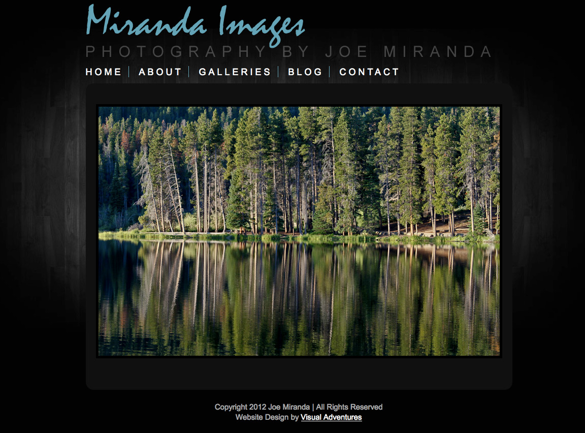
jason2012-02-15 18:49:382012-02-15 18:54:37Miranda Images Website
https://visualadventures.com/wp-content/uploads/2012/02/miranda1.jpg
852
1152
jason
http://visualadventures.com/wp-content/uploads/2017/02/visual-adv-logo-2017-300x156.png
jason2012-02-15 18:49:382012-02-15 18:54:37Miranda Images Website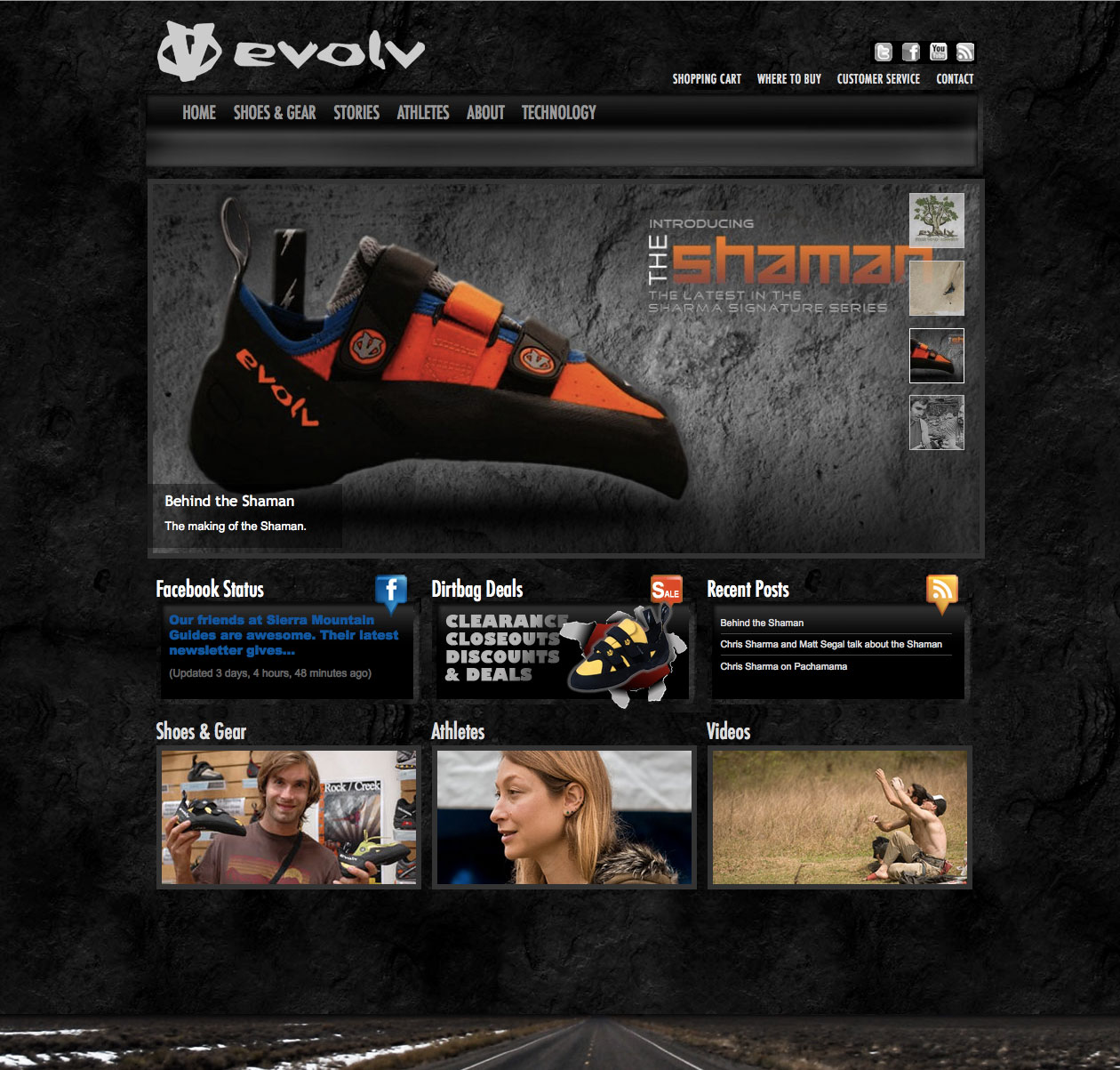 https://visualadventures.com/wp-content/uploads/2011/08/evolv.jpg
1203
1260
jason
http://visualadventures.com/wp-content/uploads/2017/02/visual-adv-logo-2017-300x156.png
jason2011-08-23 16:02:422012-01-15 21:50:38evolv Climbing Website Redesign
https://visualadventures.com/wp-content/uploads/2011/08/evolv.jpg
1203
1260
jason
http://visualadventures.com/wp-content/uploads/2017/02/visual-adv-logo-2017-300x156.png
jason2011-08-23 16:02:422012-01-15 21:50:38evolv Climbing Website Redesign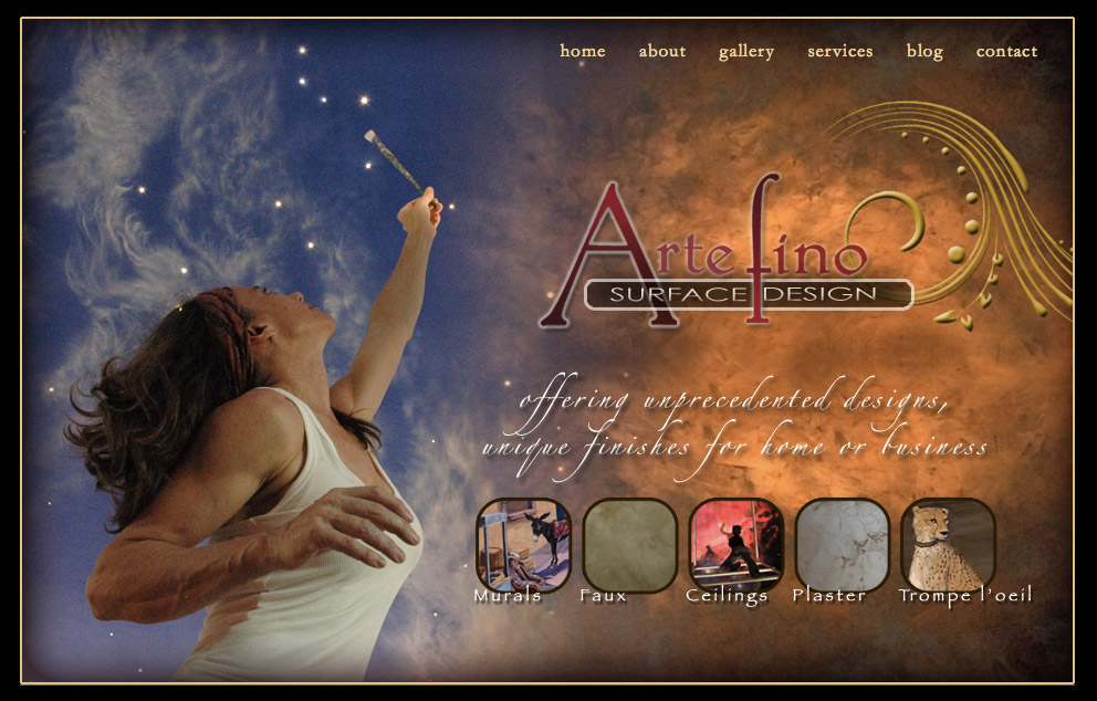 https://visualadventures.com/wp-content/uploads/2011/08/artefino1.jpg
634
992
jason
http://visualadventures.com/wp-content/uploads/2017/02/visual-adv-logo-2017-300x156.png
jason2011-08-02 21:16:382011-08-02 21:47:51Artefino Surface Design : Website Design
https://visualadventures.com/wp-content/uploads/2011/08/artefino1.jpg
634
992
jason
http://visualadventures.com/wp-content/uploads/2017/02/visual-adv-logo-2017-300x156.png
jason2011-08-02 21:16:382011-08-02 21:47:51Artefino Surface Design : Website DesignPortfolio Items
 https://visualadventures.com/wp-content/uploads/2011/07/all_mountain_adventures.jpg
1672
1174
jason
http://visualadventures.com/wp-content/uploads/2017/02/visual-adv-logo-2017-300x156.png
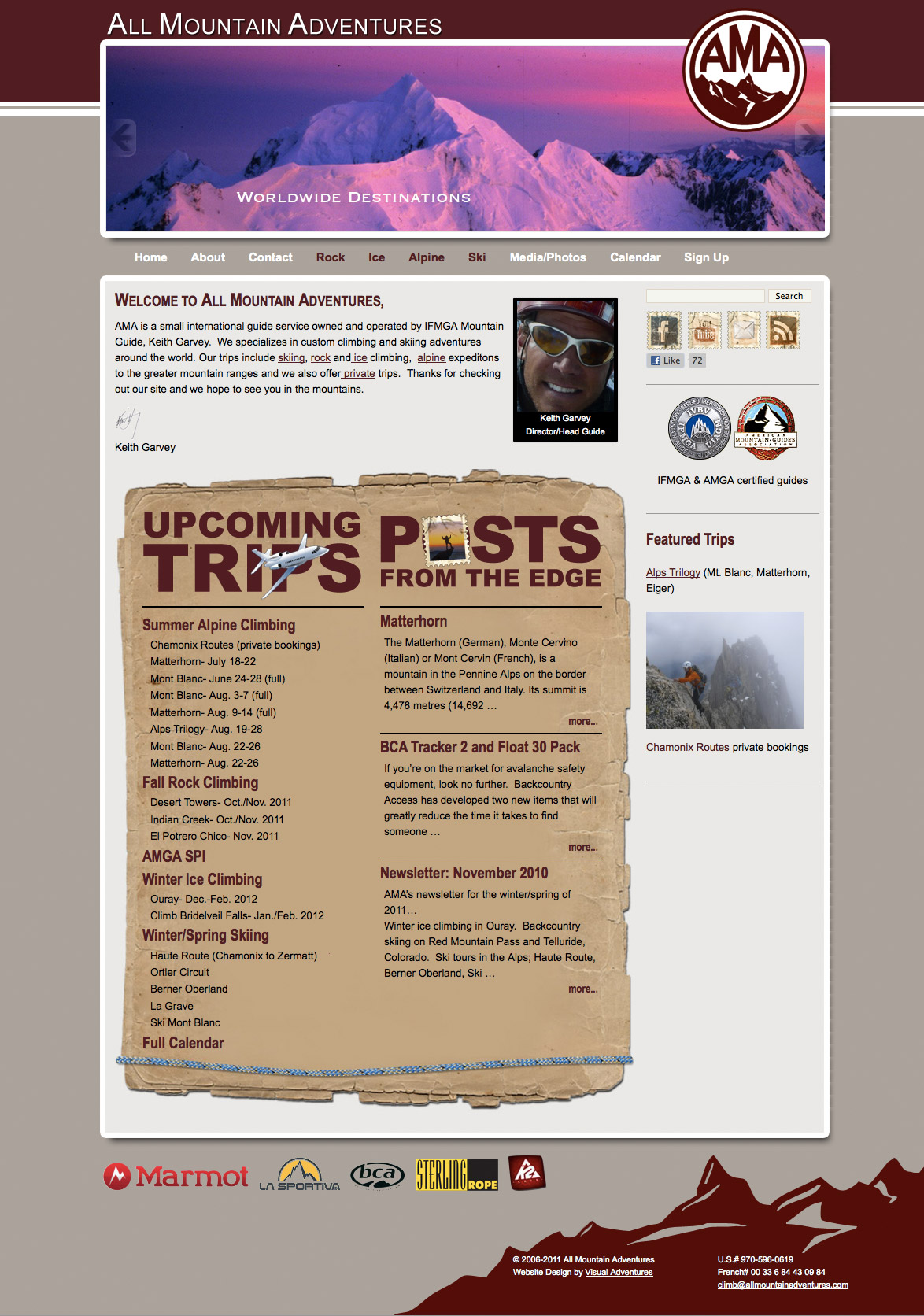
jason2015-06-17 20:03:452015-06-17 20:03:45All Mountain Adventures
https://visualadventures.com/wp-content/uploads/2011/07/all_mountain_adventures.jpg
1672
1174
jason
http://visualadventures.com/wp-content/uploads/2017/02/visual-adv-logo-2017-300x156.png
jason2015-06-17 20:03:452015-06-17 20:03:45All Mountain Adventures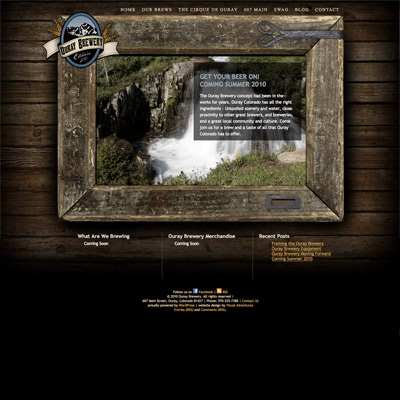 https://visualadventures.com/wp-content/uploads/2013/09/ouraybrewery.jpg
400
400
jason
http://visualadventures.com/wp-content/uploads/2017/02/visual-adv-logo-2017-300x156.png
jason2015-06-14 22:53:172015-06-14 22:57:20Ouray Brewery
https://visualadventures.com/wp-content/uploads/2013/09/ouraybrewery.jpg
400
400
jason
http://visualadventures.com/wp-content/uploads/2017/02/visual-adv-logo-2017-300x156.png
jason2015-06-14 22:53:172015-06-14 22:57:20Ouray Brewery https://visualadventures.com/wp-content/uploads/2013/09/Moonfly.jpg
200
200
jason
http://visualadventures.com/wp-content/uploads/2017/02/visual-adv-logo-2017-300x156.png
jason2015-06-14 18:42:282015-06-14 18:42:28Moonfly Design
https://visualadventures.com/wp-content/uploads/2013/09/Moonfly.jpg
200
200
jason
http://visualadventures.com/wp-content/uploads/2017/02/visual-adv-logo-2017-300x156.png
jason2015-06-14 18:42:282015-06-14 18:42:28Moonfly Design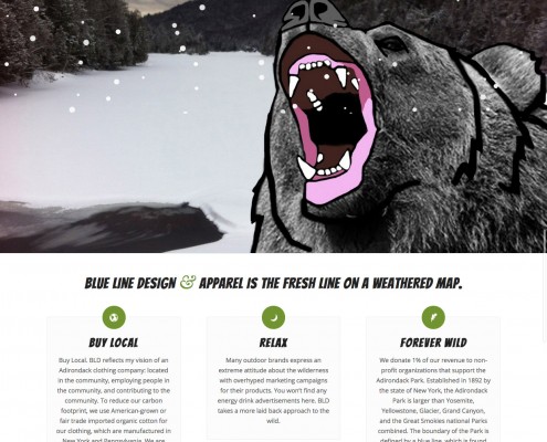 https://visualadventures.com/wp-content/uploads/2014/10/Blue-Line-Design-and-Apparel-Adirondaks.jpg
1903
1245
jason
http://visualadventures.com/wp-content/uploads/2017/02/visual-adv-logo-2017-300x156.png
jason2015-06-14 18:29:512015-06-14 18:29:51Blue Line Design and Apparel
https://visualadventures.com/wp-content/uploads/2014/10/Blue-Line-Design-and-Apparel-Adirondaks.jpg
1903
1245
jason
http://visualadventures.com/wp-content/uploads/2017/02/visual-adv-logo-2017-300x156.png
jason2015-06-14 18:29:512015-06-14 18:29:51Blue Line Design and Apparel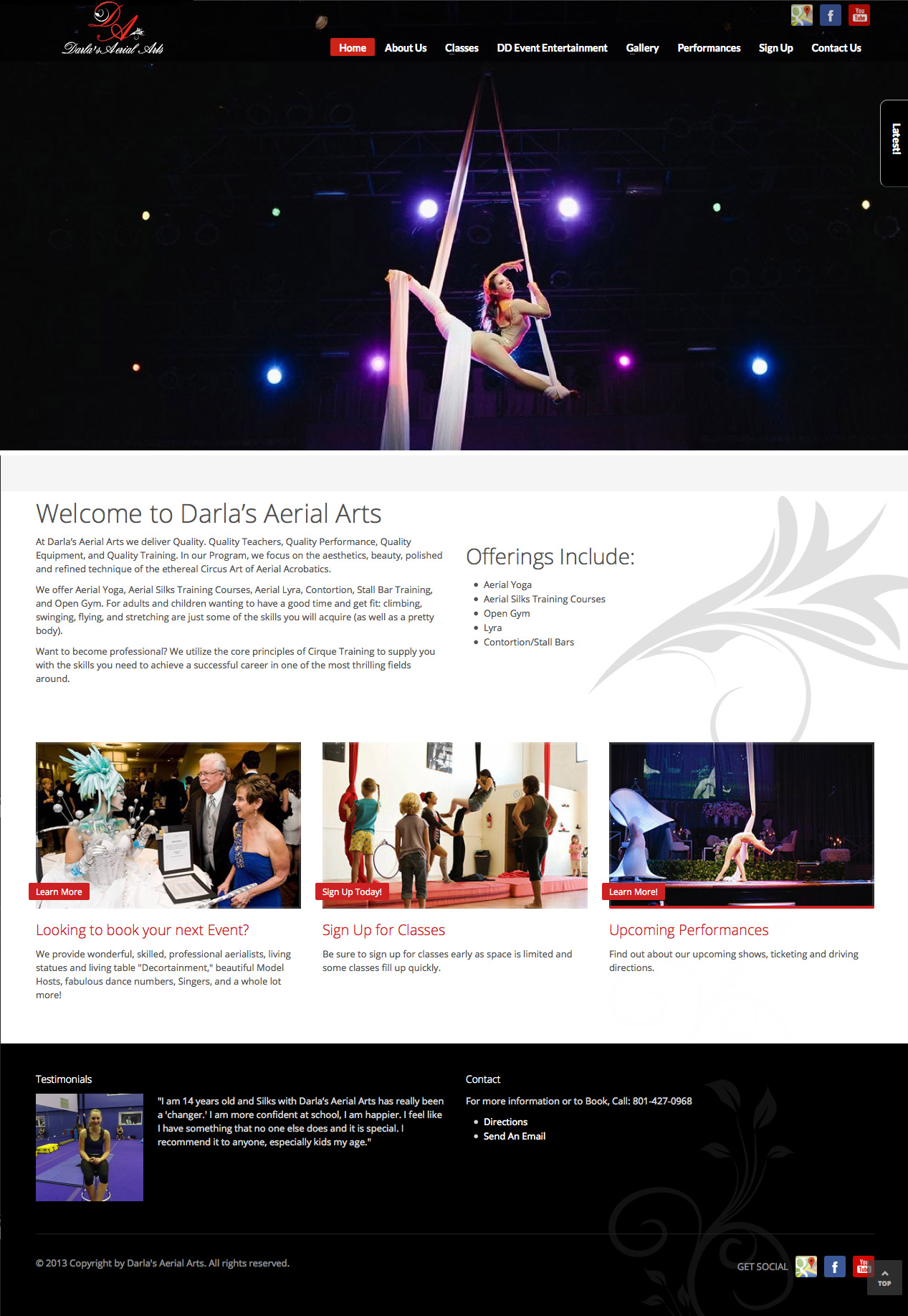 https://visualadventures.com/wp-content/uploads/2014/01/dd_site.jpg
1835
1267
jason
http://visualadventures.com/wp-content/uploads/2017/02/visual-adv-logo-2017-300x156.png
jason2015-06-14 18:26:312015-06-14 18:26:31Aeris Aerial Arts
https://visualadventures.com/wp-content/uploads/2014/01/dd_site.jpg
1835
1267
jason
http://visualadventures.com/wp-content/uploads/2017/02/visual-adv-logo-2017-300x156.png
jason2015-06-14 18:26:312015-06-14 18:26:31Aeris Aerial Arts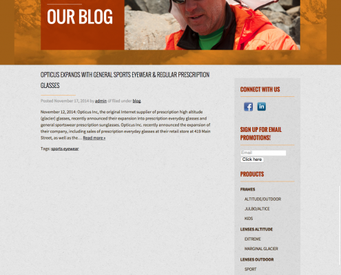 https://visualadventures.com/wp-content/uploads/2008/08/BlogOpticus.png
1657
1261
jason
http://visualadventures.com/wp-content/uploads/2017/02/visual-adv-logo-2017-300x156.png
jason2015-06-14 15:26:132015-06-14 18:15:23Opticus Sunglasses
https://visualadventures.com/wp-content/uploads/2008/08/BlogOpticus.png
1657
1261
jason
http://visualadventures.com/wp-content/uploads/2017/02/visual-adv-logo-2017-300x156.png
jason2015-06-14 15:26:132015-06-14 18:15:23Opticus Sunglasses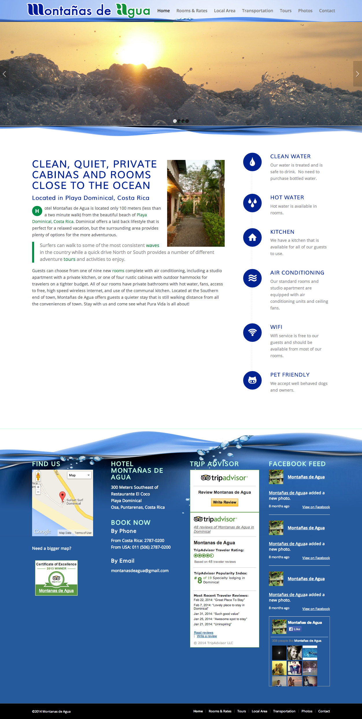 https://visualadventures.com/wp-content/uploads/2014/04/Montanas-de-Agua_1.jpg
2486
1252
jason
http://visualadventures.com/wp-content/uploads/2017/02/visual-adv-logo-2017-300x156.png
jason2015-06-14 15:16:392015-06-14 18:21:20Montañas de Agua Website
https://visualadventures.com/wp-content/uploads/2014/04/Montanas-de-Agua_1.jpg
2486
1252
jason
http://visualadventures.com/wp-content/uploads/2017/02/visual-adv-logo-2017-300x156.png
jason2015-06-14 15:16:392015-06-14 18:21:20Montañas de Agua Website